Eastern Mennonite School Reviews “Brand” and Introduces Revitalized Logo
Eastern Mennonite School K-12 has adopted an updated logo after nearly a year of conversation and processing around the school’s overall “brand.”
“A ‘brand’ is really an evolving story,” says Paul Leaman, head of school. And this review “confirmed that our brand is strong.”
The review came at a pivotal time. Over summer 2018, the 13-year-old elementary program moved from offsite to the high school’s long-time location at 801 Parkwood Drive. It is a new era in the first year of the school’s second century with all grades, K-12, together on one site.
Brand assessment
Alumni, donors, students, faculty, staff and community completed surveys and joined discussions in early 2018 about the school’s brand and logo. The review confirmed that stakeholders remembered and/or currently experienced these consistent components of the school:
- Excellent academics shaped by the arts, music, athletics and experiential hands-on learning;
- A foundation of Christian faith and values in the Anabaptist tradition;
- A community of caring and connection;
- A global outlook and respect for diversity among people.
Revitalized logo
![]() Recognizing that a school’s logo is an important entry point into the school’s story, the EMS leadership team discerned that the time was right to refresh the existing logo.
Recognizing that a school’s logo is an important entry point into the school’s story, the EMS leadership team discerned that the time was right to refresh the existing logo.
“The review confirmed that the flame element of our logo brought strong and positive associations to many people’s minds,” notes Leaman. With the new century and new K-12 chapter, “we wanted a fresh look that would distinguish our unique story while honoring the legacy and recognition of past logos.”
The updated logo retains three elements — or flickers — of a flame. Interpretations of the three flames vary, according to the research. Some respondents saw the Holy Trinity. Others were reminded of the school mission to join school, home and church to “call students to faith in Jesus Christ, academic excellence, personal integrity and compassionate service in the world.”
The flames on the updated logo respond to the survey data calling for a more active and less stationary logo.
Logo history and feedback
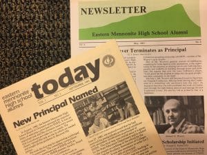 Esther Kniss ‘49 Augsburger founded the arts program at Eastern Mennonite High School in 1971 where she taught for nine years. In 1976, the board of directors approved the first logo — which Augsburger designed — for painting on the gym floor.
In September 1981 the Today alumni publication switched from a masthead featuring Massanutten Peak to the flame logo. The change came as the school marked the end of one era — the leadership of Samuel Weaver ‘52 — and the beginning of another — the principalship of J. David Yoder.
 The flame logo has served the school well in various forms to the present. In 2008 the current seal logo was adopted as branding for elementary, middle and high school together. Blue and white were formalized at that time. The yellow or gold that had been used in the logo over the years — particularly for Flames athletics — was phased out.
As part of the 2017-18 brand review, alumni, donors, faculty, staff and students shared impressions of the EMS logo and suggestions for possible update. Responses to “What comes to mind when you look at the EMS logo?” included answers as varied as “hot air balloon” to “movement,” “light,” and “Holy Spirit.” Responses to “What would you like the logo to reflect that it is currently not?” included “more active,” “reflect how EMS is evolving,” “service,” global,” “academic excellence” and “peace.”
 The revised logo was chosen by a design team including Andrew Gascho, communication technology teacher and IT support; Malea Gascho, art teacher; Paul Leaman, head of school; and Andrea Schrock Wenger, director of advancement. They heard input from the EMS leadership team, faculty, staff, students and board members. The process was led by Harrisonburg-based marketing consultants, Gravity Group. The design retains the flame motif, but is removed from the closed circle to reflect the open and welcoming spirit of the school. An accent option of gold — drawing on the historic use of gold or yellow for Flames athletics teams — will be available for design purposes, alongside the blue logo.
A new era
“A logo is a tricky thing” admits Leaman, noting that change is hard for some and that personal preference varies greatly. “The most important thing,” he says, “is that our school’s story is strong. People are proud to be part of this story and want to see us thrive in our new century. We are well on the way.”
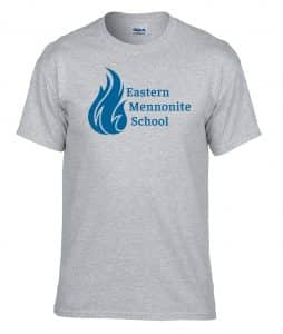
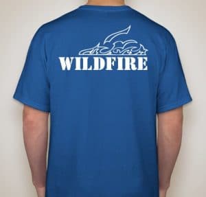 Rollout of the revised logo began with the Student Council Organization (SCO) revealing the logo during chapel with the middle and high school on Monday, Oct. 15. It was the first day of Spirit Week leading up to Homecoming and Family Weekend, Oct. 19-21. On Wednesday, elementary students will learn about logos and see the new design in their weekly gathering. On Friday, everyone in the school — K-12, faculty and staff — will receive a grey T-shirt with the new logo. Some signed up to instead receive a blue “Wildfire” T-shirt with white school logo on front and emblem on back — designed by Afton Rhodes-Lehman ’20 — for the student pep club.
The logo will be implemented as new print materials are rolled out. The new school website with the new design will be launched early in the new year. External signage and other updates will happen in a timely manner, while also taking costs into consideration.